Set up Behavioral Emails
This document explains how to create behavioral emails by defining your email template settings and using the email editor to build beautiful, responsive email designs.
Prerequisites
Before you can create a new email template, you must already have a saved behavioral cohort.
Create an Email Template
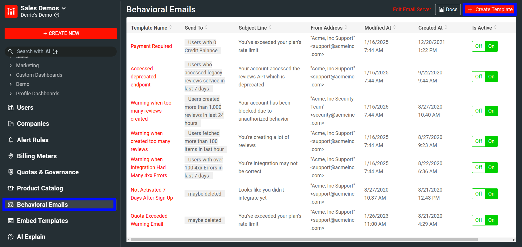
- Select Behavioral Emails menu item in the navigation menu and then select + Create Template.
![Selecting Behavioral Emails menu item and then Create Template.]()
- Alternatively, select + New from the navigation menu and then select Behavioral Emails from the User Guidance & Alerts section.
- Select + Create Template.
-
You have the option to start from blank or choose from a set of predefined templates for different use cases. Select the one that suits you.
If you select a predefined template, Moesif asks for your confirmation to create the suitable user cohort for that email template. The cohort defines the audience to send emails to. Select Continue to confirm.
If you choose to start from blank, you must create the user cohort by yourself.
Each email template is disabled by default when you first create them. To enable them, select the On | Off toggle to the on position.
Define Email Template Settings
In the template editor, fill in the necessary information to define your email template.
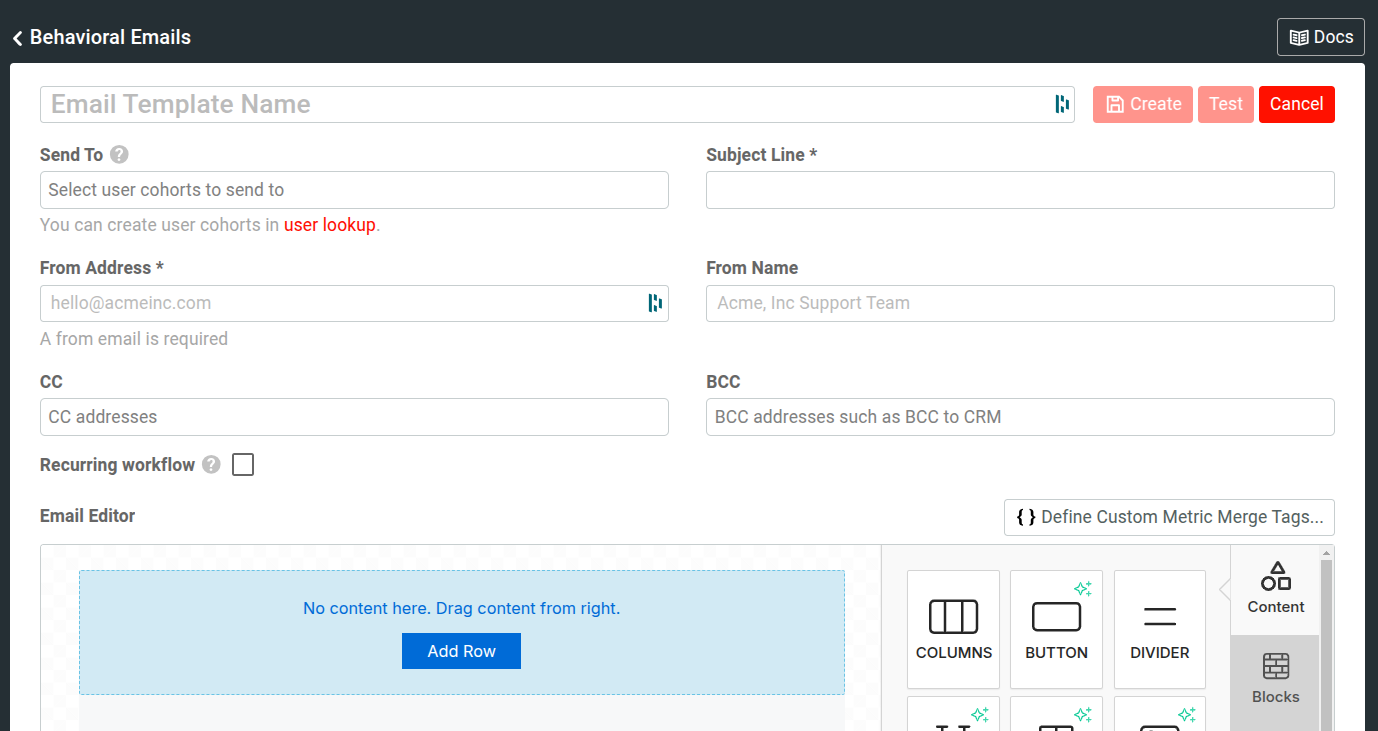
Template Name
You must specify a name for your email template in the Email Template Name field.
Recipient
You must specify who you want to send emails to by selecting one or more saved user cohorts from the Send To list. If you choose a predefined email template, Moesif creates the appropriate cohort for you.
A saved user cohort is a dynamic group of users that matches one or more criteria. For example, a cohort can represent users who’ve made over a hundred API calls in the last five days from Node.js.
Subject Line
You must specify your email subject line in the Subject Line field.
Sender Address and Name
In the From Address field, you must specify the email address who you want to send email as. To ensure the best email deliverability, configure your domain correctly for DomainKeys Identified Mail (DKIM) and Sender Policy Framework (SPF) email authentication methods in your email provider.
Optimally, specify a user-friendly name that your recipients see when they receive emails from you in the From Name field.
Cc and Bcc
You can also add Cc and Bcc addresses in the CC and BCC fields respectively. Many CRMs provide a Bcc address so you can log any customer communication right in your CRM.
Recurring Workflow
Normally, a user can only receive the same email once. However, you can make the template recurring by selecting the Recurring Workflow checkbox.
You can re-enrol users who still meet your cohort criteria into this email workflow. Recurring workflows can help you in different situations—for example, exceeded quota warnings, monthly billing reminders, and so on.
If you set the workflow as recurring, you must define the time period that must pass before a user becomes eligible for re-enrollment. Keep in mind the user must still be a member of your cohort after the time has passed. For example, if you want to create a workflow that sends warning emails to any customer who has exceeded their subscription up to two times per billing month, you can define the re-enrollment period as 15 days.
The Email Editor
The Email Editor allows you to build beautiful and responsive emails using drag and drop modules and components. We have tested the templates extensively with Litmus and Email On Acid to ensure rendering in a variety of email clients.
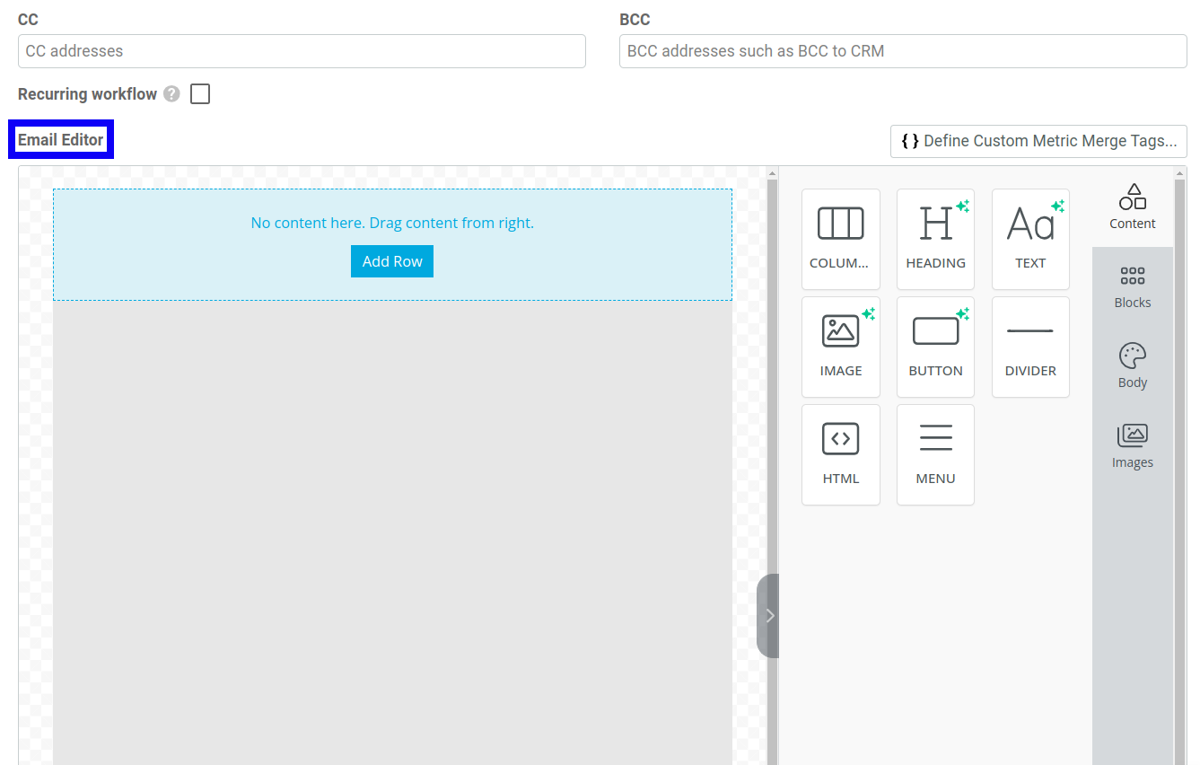
The following sections discuss the features of the email editor.
Content Module
The components in the Content module contain several options to design the content of your emails.
The following components are available:
- Columns
- Buttons
- Divider
- Heading
- HTML
- Image
- Menu
- Text
When you select a component, you can customize the look and feel of the component for desktop and mobile screens from the Desktop and Mobile tabs.
Columns
Using the Columns component, you can add columns in your email for better design arrangement. This component contains the following customization options:
- Columns
- How many columns you want in a specific row.
- Column Properties
- The background color, padding, and border of columns.
- Row Properties
- Allows customization of the following row properties:
- Background color
- Content background color
- Background image
- Padding
- Responsive Design
- A toggle to show or hide the column in a row on desktop screens.
Buttons
The Buttons component allows you to add buttons to your emails. It contains the following customization options:
- Smart Buttons
- AI to generate helpful suggestions to make buttons more effective for different use cases.
- Action
- The type of action the button performs. For example, opening a new URL, sending email, and calling a phone number.
Select the action from the Action Type list and fill in the necessary details of the action. For example, if you choose Send Email, specify the recipient email address, email subject, and email body.
- Columns
- How many columns you want in a specific row.
- Button Options
- Allows customization of the following button properties:
- Text color
- Background color
- Font family
- Font weight
- Font size
- Alignment
- Width
- Spacing
- Line height, padding, and border of a button.
- General
- The padding of a button’s container.
- Responsive Design
- A toggle to show or hide a button on desktop screens.
Divider
The Divider component lets you add spacing between components of your email. It’s equivalent to the <hr> HTML horizontal rule element. This component contains the following customization options:
- Line
- Allows customization of the following properties:
- Width
- Line type and thickness
- Alignment
- General
- The padding of the divider’s container.
- Responsive Design
- A toggle to show or hide a divider on desktop screens.
Heading
The Heading component lets you add four levels of section headings. It’s equivalent to the <h1> to <h4> HTML heading elements. This component supports the following customization options:
- Smart Headings
- AI to generate helpful suggestions to make headings more effective for different use cases.
- Text
- The heading text. You can customize the following text properties:
- Heading level from H1to H4
- Font family
- Font weight
- Font size
- Color
- Text align
- Line height
- Links
- Allows you to customize the appearance of a hyperlink in a heading. Turn off the Inherit Body Styles toggle to apply your custom styling.
- General
- The padding of a heading’s container.
- Responsive Design
- A toggle to show or hide a heading on desktop screens.
HTML
The HTML component lets you add custom HTML to further customize the design beyond what you can do with the other tools. This component has the following options:
- HTML
- The textarea to type in custom HTML.
- General
- The padding of the container.
- Responsive Design
- A toggle to show or hide the HTML on desktop screens.
Image
The Image component allows you to add images in your emails. It supports the following options:
- Magic Image
- Use AI to generate custom images.
- Image
-
Lets you add images from different sources:
- Your local machine
- Image URL
- Stock photos from providers such as Unsplash, Pexels, and Pixabay
- Action
- You can make an image interactive like a button and have it perform an action when a user interacts with it. For example, opening a new URL, sending email, and calling a phone number.
Select the action from the Action Type list and fill in the necessary details of the action. For example, if you choose Send Email, specify the recipient email address, email subject, and email body.
- General
- The padding of the container.
- Responsive Design
- A toggle to show or hide an image on desktop screens.
Menu
The Menu component lets you add navigation menus. It contains the following options for customization:
- Menu Items
- The menu items in a menu.
Select Add New Item to add a menu item. For each menu item, you can select the menu text and the action it performs when a user interacts with it. For example, opening a new URL, sending email, and calling a phone number.
Select the action from the Action Type list and fill in the necessary details of the action. For example, if you choose Send Email, specify the recipient email address, email subject, and email body.
You can also change the order of menu items by drag and drop. To delete a menu item, select Delete.
- Styles
- Lets you customize the following properties of the menu:
- Font family
- Font weight
- Font size
- Text color
- Link color
- Alignment
- Layout
- Padding
- General
- The padding of the container.
- Responsive Design
- A toggle to show or hide a menu on desktop screens.
Text
The Text component lets you add text with a full suite of different styling options. The following options are available:
- Text
- Lets you customize the following text properties:
- Font family
- Font weight
- Font size
- Text color
- Text align
- Line height
- Links
- Allows you to customize the appearance of a hyperlink in your text. Turn off the Inherit Body Styles toggle to apply your custom styling.
- General
- The padding of the container.
- Responsive Design
- A toggle to show or hide text on desktop screens.
Layout Blocks
The Blocks component can help you structure your email template. They are containers that can hold content components and make designing a layout easier—for example, defining a layout that uses multiple columns with varying widths.
Body
The Body component provides general configuration and styling options for your email templates. For example, defining the link color, text alignment, and content width. The options you specify here apply globally. You can override any property of an individual component using the component’s available options.
The following options are available:
- General
- Lets you customize the following properties:
- Text color
- Background color
- Content width
- Content alignment
- Font family
- Font weight
- Email Settings
- Lets you add email preheader text. A preheader is the short summary text that follows the subject line when a user views an email in their inbox.
- Links
- Lets you customize the appearance of links.
Images
The Images component lets you search for images across sources like Unsplash, Pexels, and Pixabay. You can also generate images using AI.
After you find an image, drag and drop the image into an image component to add it to your email template.
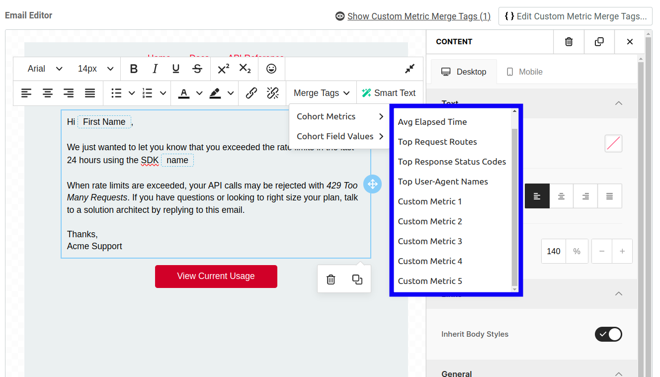
Merge Tags
Merge tags lets you personalize email for each user. You can insert merge tags into a block of text by selecting Merge Tags from the text editor menu bar.
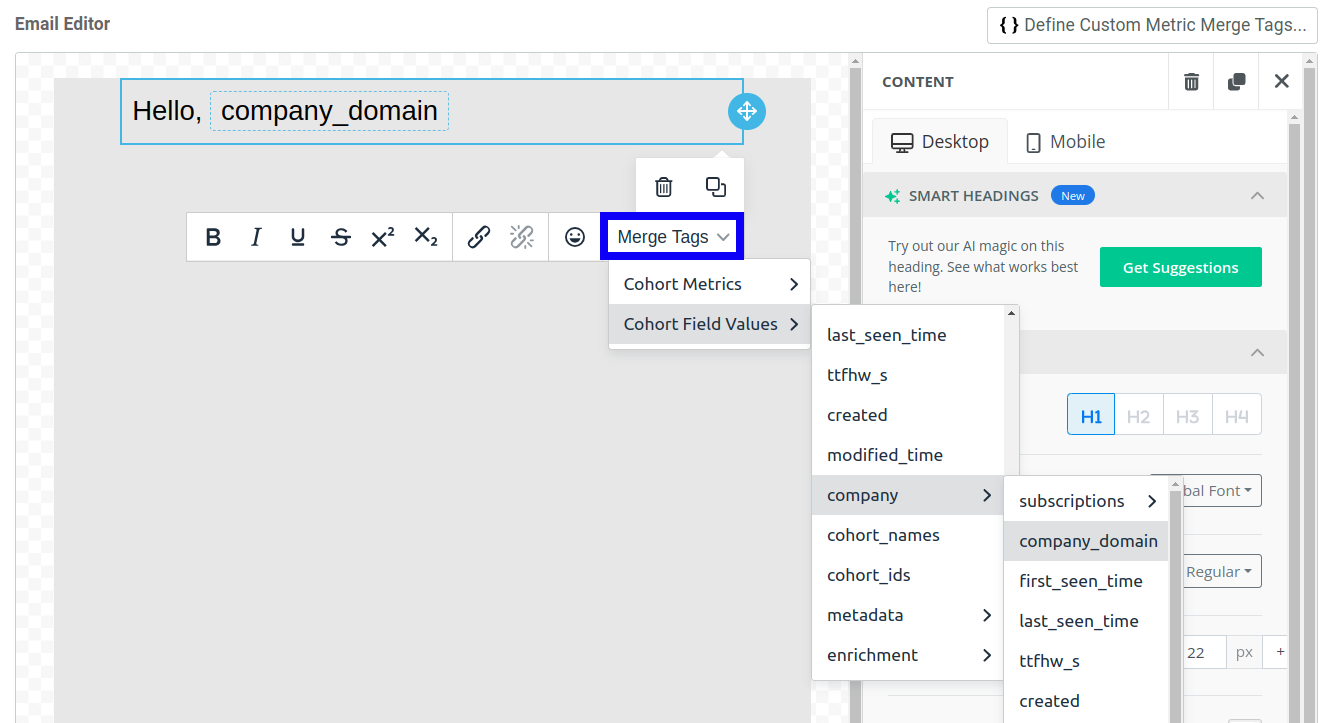
You can insert any analytics field, including custom metadata, into the email such as the name of the user or their plan.
Adding Custom Metrics via Merge Tags
You can also add aggregated event metrics into the email body using merge tags. These custom metrics can help with sending emails that have tailored quota and usage content. Depending on the data type within the field, you can access certain operations or aggregations.
The following table summarizes the available aggregator types for different data types:
| Operation | Result | Applicable Data Type(s) |
|---|---|---|
Top Terms |
returns an array of the top terms within the aggregated events | string |
Min |
returns the min value from the aggregated events | number, date |
Max |
returns the max value from the aggregated events | number, date |
Average |
returns the average value from the aggregated events | number, date |
Sum |
returns the sum of the value from the aggregated events | number, date |
Limitations
Custom metric tags have the following limitations you need to keep in mind:
- The target cohort must have a behavioral criteria defined in the Who Performed filter.
- The email can have only one target cohort as the email’s destination.
- You can define only five custom metrics. If you define a metric but don’t use it in the email as a merge tag, Moesif doesn’t save that particular metric.
- Custom metrics do not support aggregating request or response body.
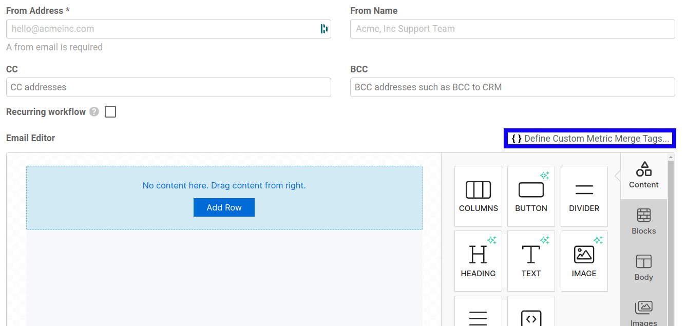
Create a Custom Metric Merge Tag
To add custom metrics within an email, you must first define the custom metric merge tags:
- Select Define Custom Metric Merge Tags.
![Accessing merge tags from menu in a block of text inside the email editor]()
- In the dialog that appears, select the custom metric field and the aggregator function. The aggregator functions you have access to for each merge tag depends on the data type of the associated metric field. For example, for numeric metric fields, the following aggregator functions are available:
MinMaxAverage(Unweighted)Sum(Unweighted)
You can add up to five custom metric merge tags.
- Select Set Merge Tags.
Now you can reference reference the merge tags in the email body. In the email editor, select your custom merge tags by going into the text editor, clicking in a text area, and selecting the custom merge tag from the Merge Tags dropdown menu.