Using Time Series Charts to Explore API Usage
One major reason for digging into API and product analytics is to be able to easily identify trends in the data. Of course, trends can be very tough to see when looking at something like raw API call logs but can be much easier when looking at a chart aimed at easily allowing you to visualize trends. Enter the Time Series chart.
A Time Series chart looks at trends over a specified interval of time. You’re probably familiar with these types of charts in everyday life. Charts showing the average returns per month from the S&P 500 index, for instance, are usually shown in a time series chart. Imagine if you could have this type of chart to display API metrics like call volume, average latency, or even something more business-centric like the number of new users who got on-boarded per day or week. With Moesif Time Series capabilities, you can do exactly this.
What Is a Time Series?
In the context of API and product analytics, a Time Series analysis allows you to view aggregated trends for the API traffic over a certain time period. In general, a time series chart is a way of displaying a data set that measures some quantity over time. Time Series charts are used for statistics, signal processing, econometrics, mathematical modeling, and many other uses.
Benefits of Using Time Series
There are many benefits of using time series reports to show API usage. The benefit to time series data is that it is easy to collect and track over time. Using a Time Series chart is a great way to visually identify trends and easily compare historical data. The other benefit is that a Time Series chart can also help companies to identify possible trends in the future as well by allowing the to visually predict where trends may be headed.
In the context of APIs and product analytics, Time Series charts are also an easy way to display data to those who are less technical. Unlike other types of reports that may take some technical knowledge to decipher, the visual nature of a Time Series report makes it easily digestible.
Time Series can be created for different time periods, such as hourly, daily, weekly, monthly, or yearly. This allows you to compare usage over different time periods. This can help developers plan for future traffic and optimize their API for performance. This information can be used to improve API design, optimize performance, and troubleshoot issues. Additionally, time series can be used to track customer satisfaction or monitor SLAs (service-level agreements).
How To Create a Time Series Chart
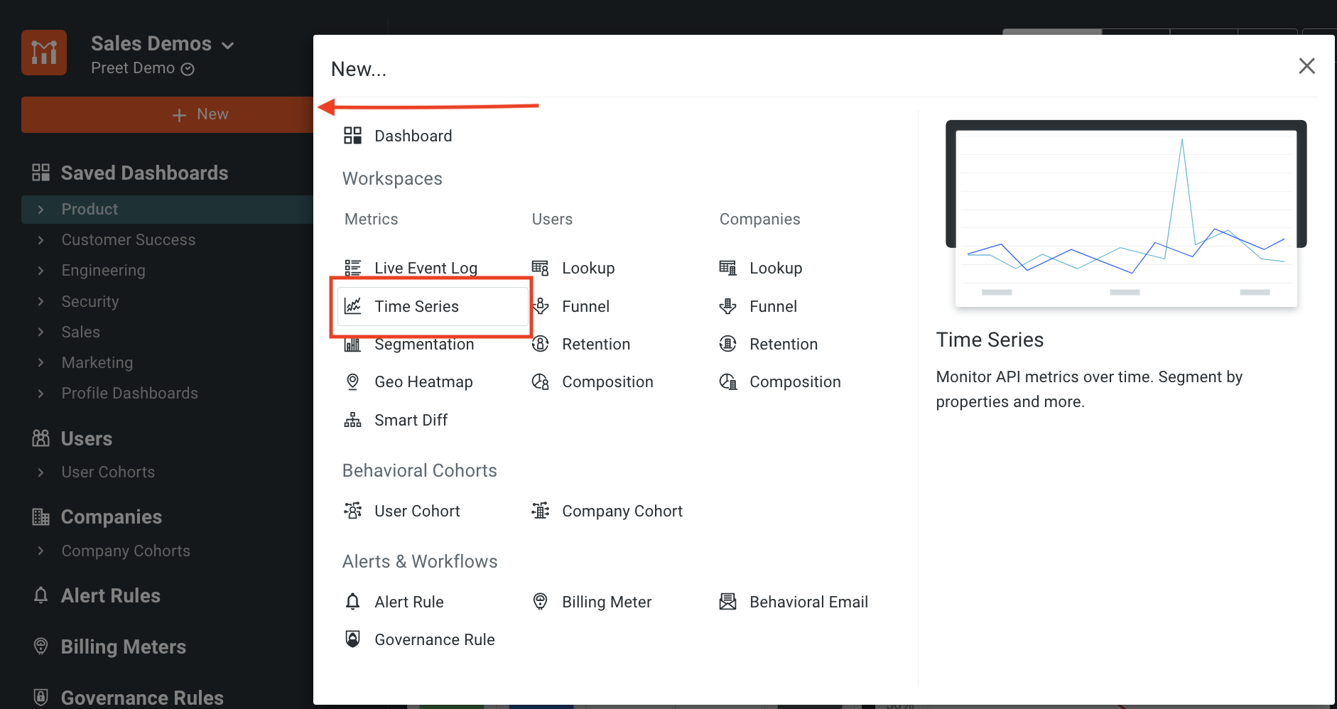
Creating a Time Series chart with Moesif is extremely simple. The first step is to navigate to the Time Series screen which can be done by clicking on the New button and selecting Time Series under the Metrics option.
Once you’re on the Time Series screen, you can build filters based on the data you’d like to track within your Time Series chart. Moesif allows users to easily build filters by parsing through your data to make this more efficient.
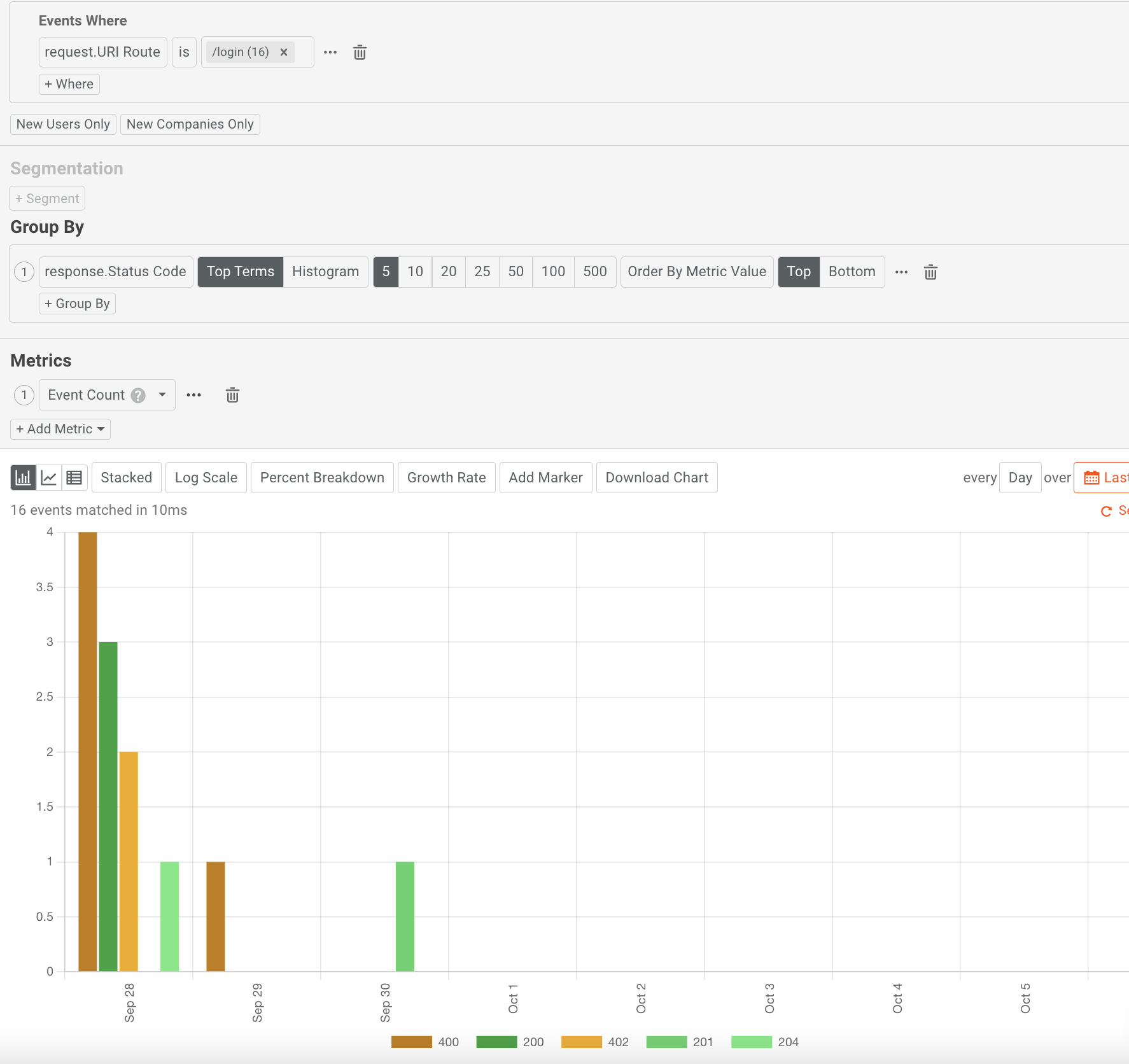
For example, you may want to display the Time Series data to show trends in 404 - Not Found errors that users are experiencing. To do this, you would add a filter for response.Status Code = 404 Not Found. Below is how this would look when input into Moesif.
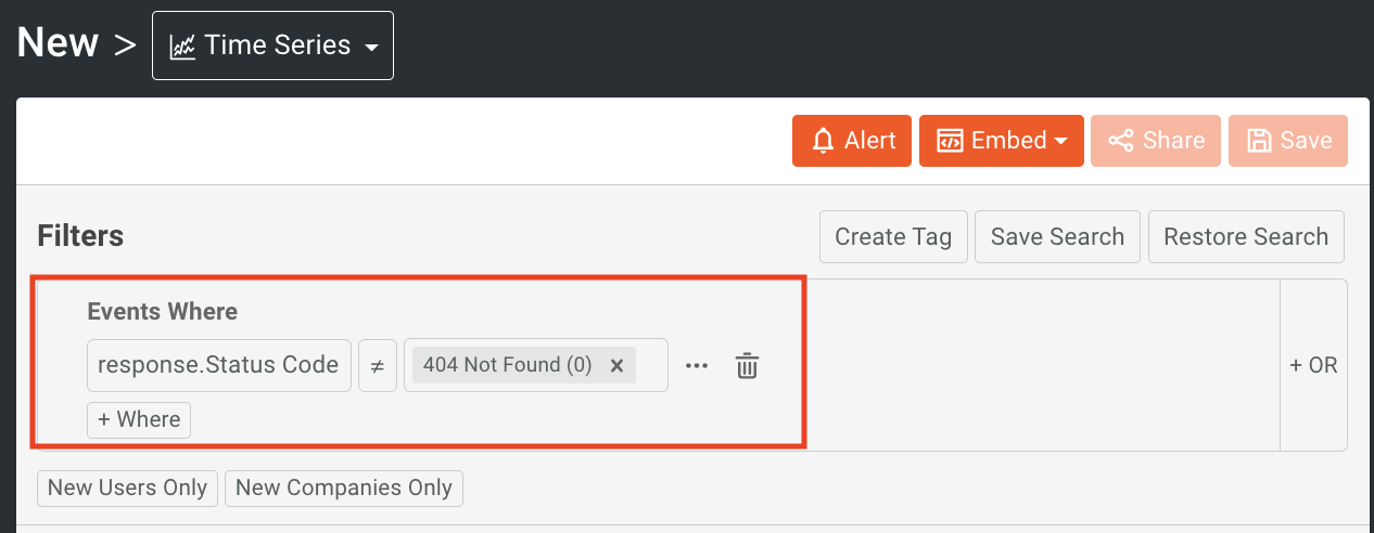
If you want to be even more specific in your event criterion, you also have the option to filter on multiple events by selecting the + Where button, and adding additional criteria.
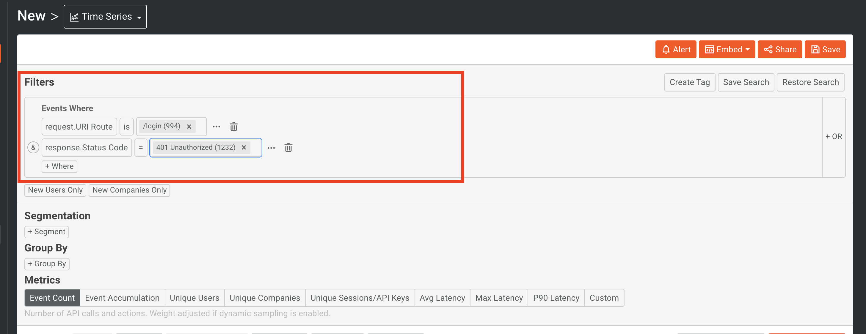
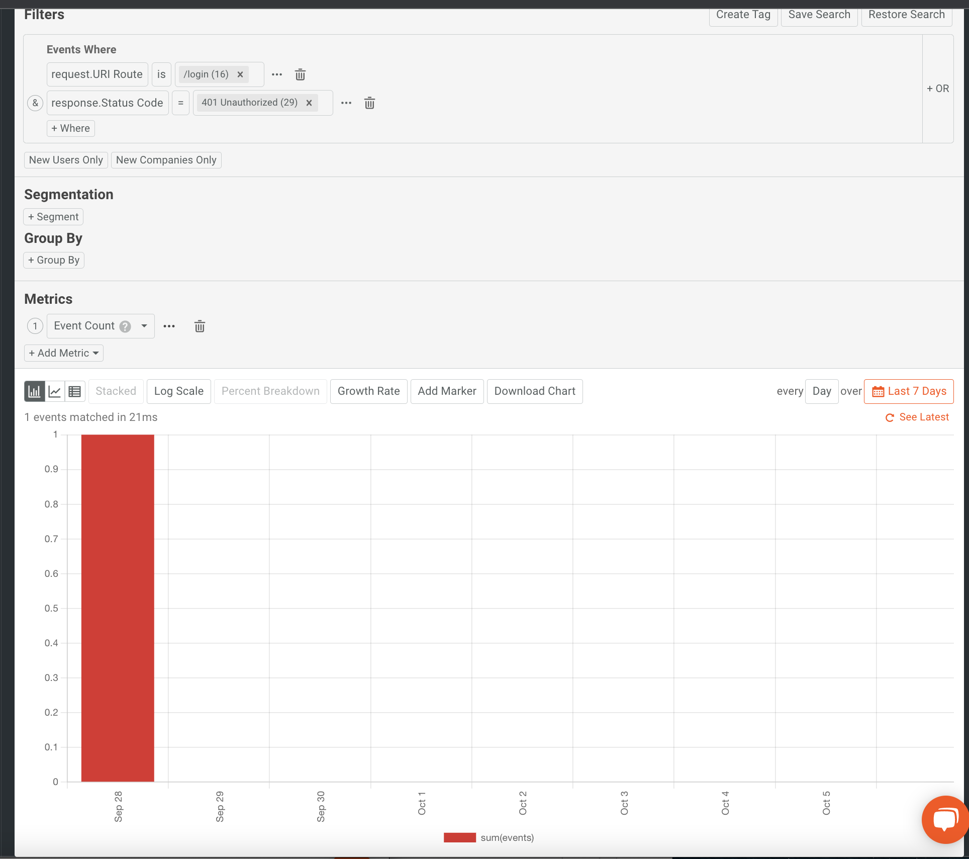
The results will appear as shown below using the bar chart style. Moesif is able to accommodate almost infinitely complex filtering since there is no limit to the amount of additional where clauses you may add.
If you filter events on your Live API Log, the same filters will work for filtering time series charts. For more specifics, check out our docs.
How Time Intervals Work with a Time Series Chart
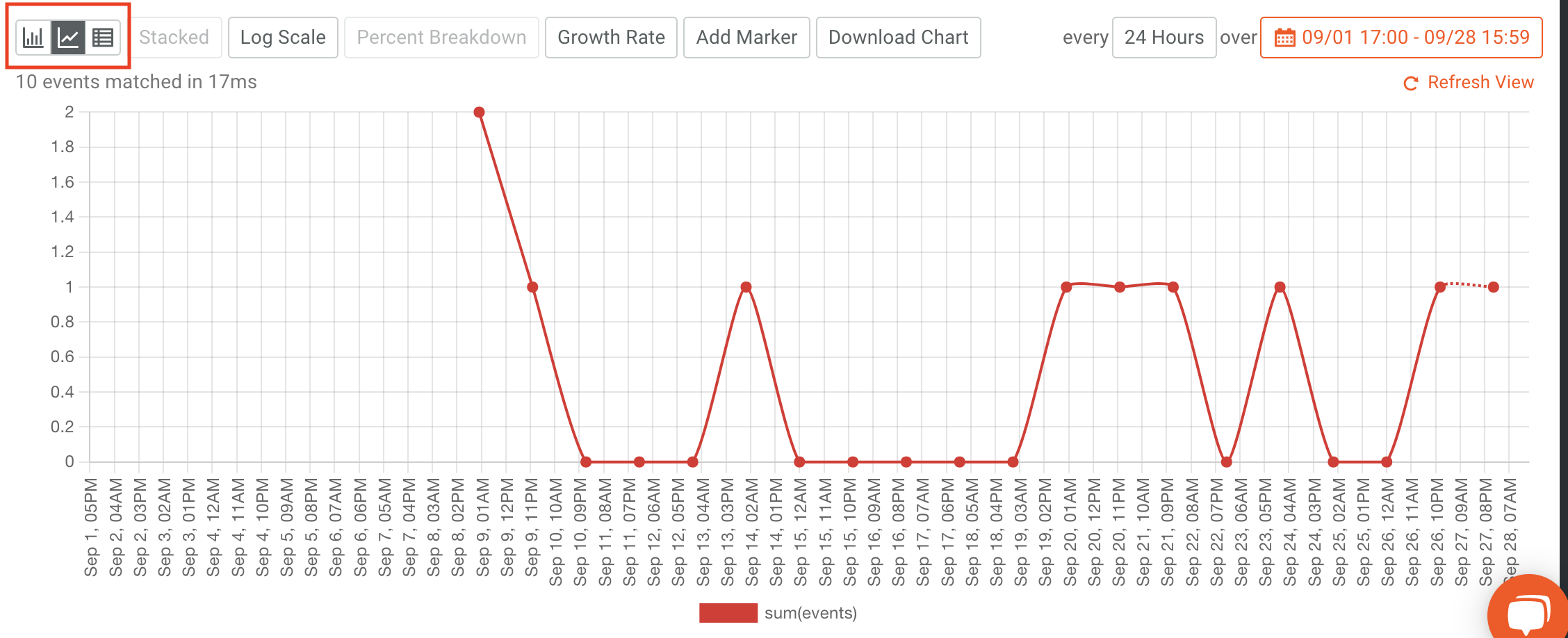
Moesif will align the time intervals by matching the bottom and top of the interval. You can change your global time zone by going to Apps and Team settings. By default, the browser’s own time is used as the timezone, but you can make any change to this as you want. Moesif always aligns to a calendar interval, so the very last one may not be completely reported. For example, if the current time is 5:55pm and you selected an interval of “Daily,” then the last interval would only include data from 12:00 AM to 5:55pm. This incomplete interval will usually be shown as a dashed-line on the Time Series, showing that interval is not completely reported.
Adding a Group By for Deeper Insights
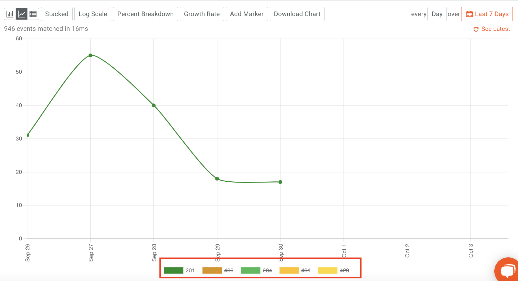
Moesif Time Series charts support Group By functionalities as well. Using Group By allows you to group data by a specific criteria. This could be something along the lines of grouping data by the Response.StatusCode, Company Domain, UserId, or even something like Initial UTM Source. The chart below is showing a Time Series that is grouping by the Response.StatusCode for each API call to the /login endpoint. This could help users to see trends in specific responses and aid teams in understanding how to potentially solve problems if the trends are negative, such as a high occurrence of error status codes.
If there are too many lines on the chart and it is getting crowded, you can select the name of one of the time series’ grouped metrics in the legend below the chart to show or hide an entire line. This can be extremely useful when there are large amounts of data an lines plotted in the Time Series chart.
How To Use API Metrics Within a Time Series Chart
You can plot additional metrics in addition to event count. You can choose from predefined metrics or create custom metrics for your own data needs. There are various options available:
- Event Accumulation
- Unique Users
- Unique Companies
- Unique Sessions/API Keys
- Avg Latency
- Max Latency
- P90 Latency
- Req Body Count
- Res Body Count
- Sum Req Content-Length
- Custom Metric
Fields that are numeric or have dates will show the min, max, and average of data fields and the distinct values. Fields that are string types will only show the distinct values.
For example, adding a custom metric allows you to use more than one metric on your chart. This can be done using the custom metric option in the Metrics dropdown. Additionally, you can add more than one metric on your chart by clicking the button + Add Metric again.
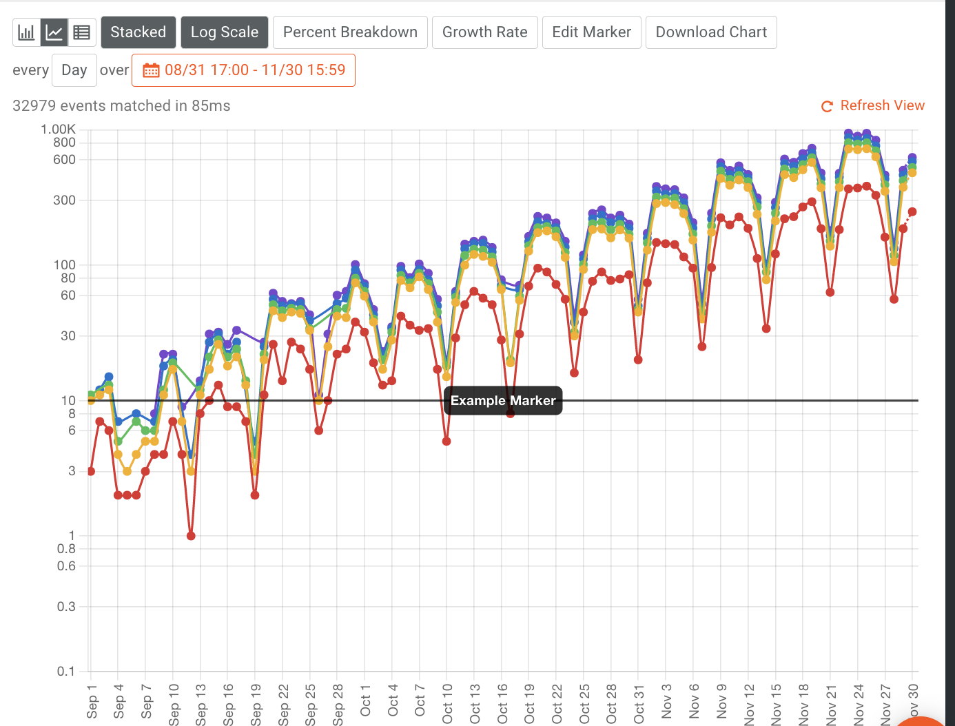
How To Change Chart Style
Time Series charts can be rendered using three different styles, Bar, Line or Table.
Click the top left of a Time Series to get the bar, line, or table view.
You can also view your data using the following options of Log Scale, Percent Breakdown, Growth Rate, and Add Marker.
Percent Breakdown plots a calculated value of each group over the sum of all groups for each interval. Growth Rate plots a calculated value comparing previous intervals, starting on the second interval. Add Marker lets you interact with the graph by adding a line.
Saving Your Chart
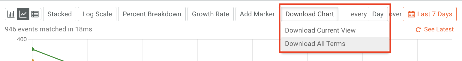
Saving to CSV
If you simply want to extract the plotted data, Moesif gives the option to download the current events via a CSV file.
 \
\
If you are downloading all terms, we recommend using the Bulk Export feature to get this data.
Saving work as a public link or embedded template
Moesif allows you to save your work with your peers multiple ways.
- Private
- Team
- Public Link
- Embed Template
To create one, click on the share button at the top of the Time Series dashboard.
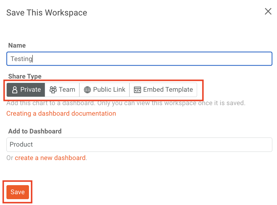
To create a private workspace, in the modal will appear make sure Private is selected. You can then name your new workspace, and select the dashboard you would like to add it to. Lastly, click on the Save button on the bottom left of the modal to save the workspace to the selected dashboard.
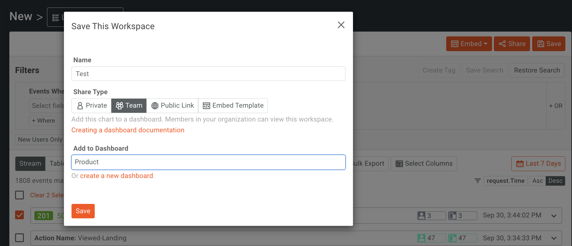
To create a workspace to share with your team, the steps are very similar to creating a Private dashboard. Make sure Team is selected, name your workspace, and add it to the desired dashboard. Make sure to click Save to save your workspace to the dashboard.
Public Link
A Public Link can be used to securely share metrics. A Public Link allows you to embed charts in an iFrame. To create one, click on the Share button at the top of the Time Series Log screen.
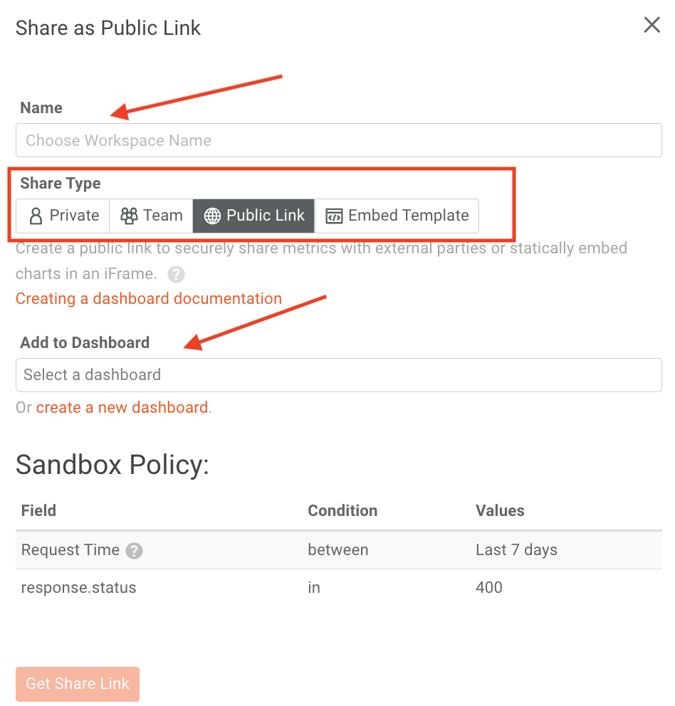
Click on Get Share Link to generate the link to be embedded where you need it.
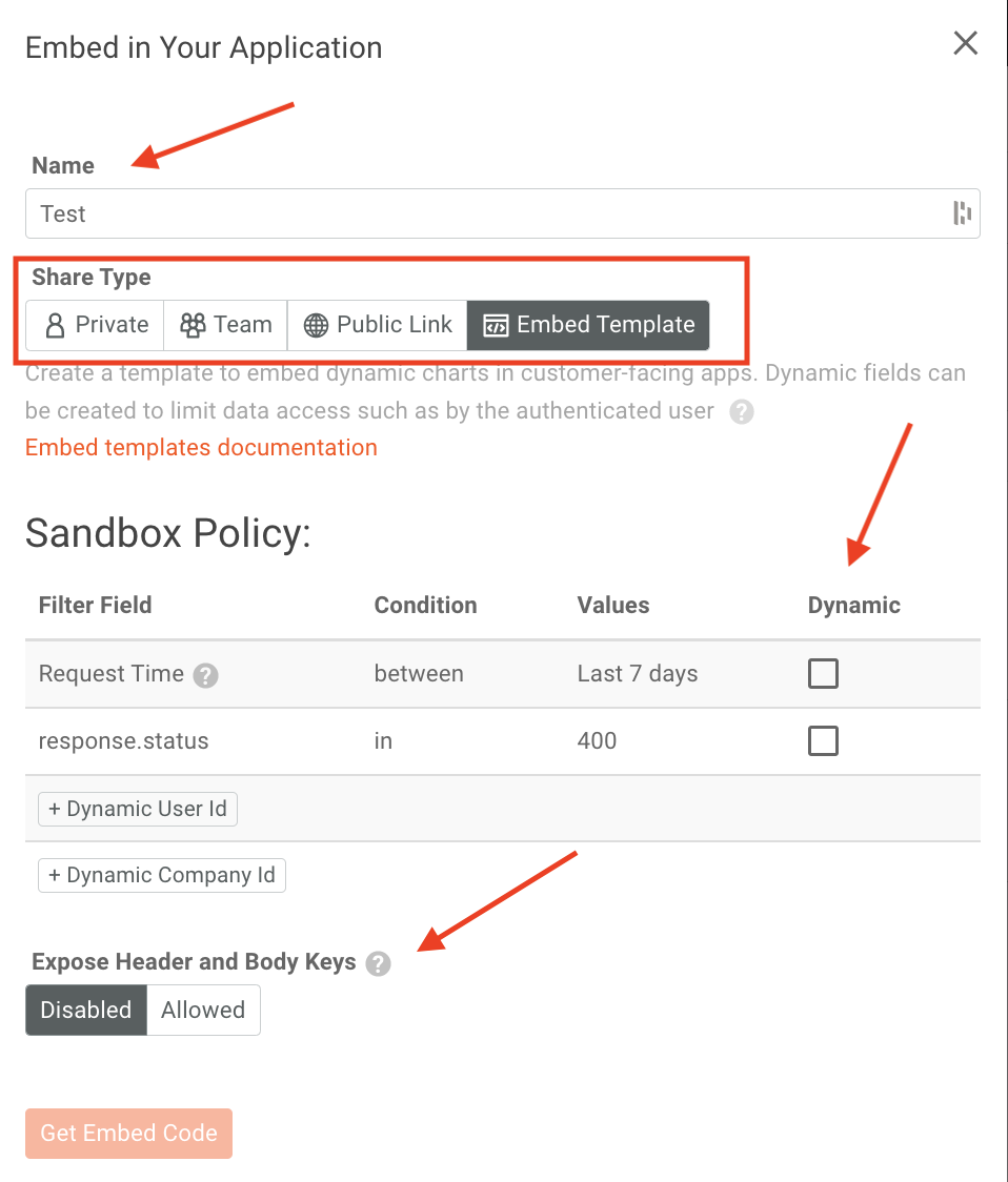
Embedded Template
With Embedded Templates, you can embed dynamic charts into customizable layouts. And if it’s a more complicated data visualization, Dynamic Fields will let you restrict the data only to those you authorize.
To create a template and embed it in an app, click on the Embed button at the top of the Time Series screen, then select Create Template.
Headers and bodies are private by default, but if you need to filter based on those fields, you can change the settings. It’s important to note that all customers that use the template will see the same filter applied to the data.
Access via API
With Embedded Templates, you can customize the app for your customers. For example, you can create a button to generate a chart with their data by entering in the dynamic fields.

You can get the following data, with a subscription to the Management API, by generating a Management API Key with the read:events scope. Replace YOUR_MANAGEMENT_API_KEY in the below command and execute.
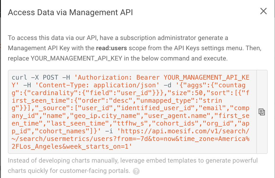
Accessing the data via API can allow for more complex customization. If complex customization is not what you’re after, the simplest route will be to leverage Embedded Templates instead.
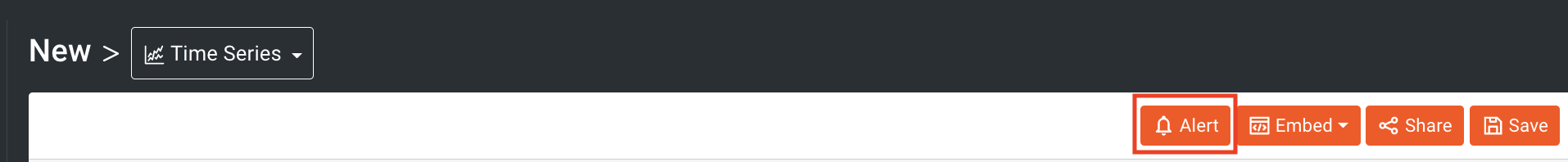
Creating Alerts
Alert rules are an important feature for users that want to monitor and proactively take steps to keep customers happy. For instance, you may want to be alerted when a large number of customers have their traffic decrease or latency increase. You can use alert rules to monitor the API’s you have created. Docs for Alerting here
To navigate to Alerts to the top right of your Time Series Screen.
The filters that you have applied will pop up in the alerts tab to the right of the screen.
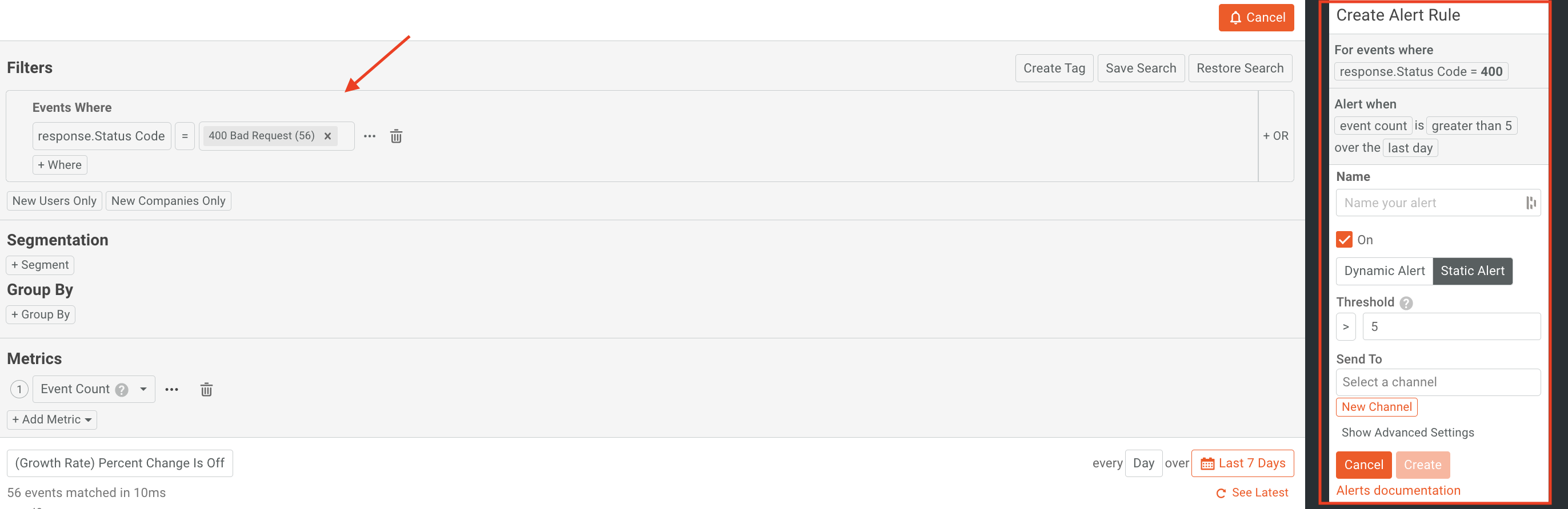
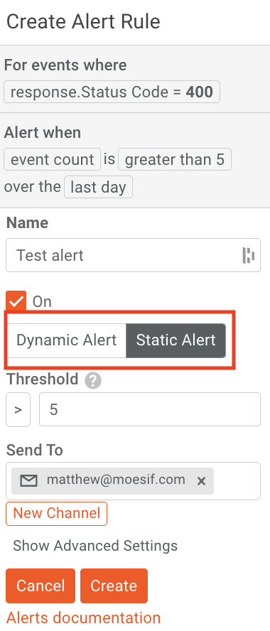
Moesif gives you the option of creating either a Dynamic Alert or a Static Alert. Dynamic alerts look for spikes and trends in regards to API usage, rather than looking for predetermined thresholds.
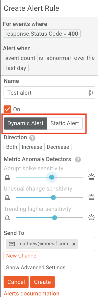
Static Alerts allow you to receive notifications when an endpoint reaches 1,000 calls per hour. When this happens, a notification will be sent to a predetermined channel.
Set Up Your New Channel Modal
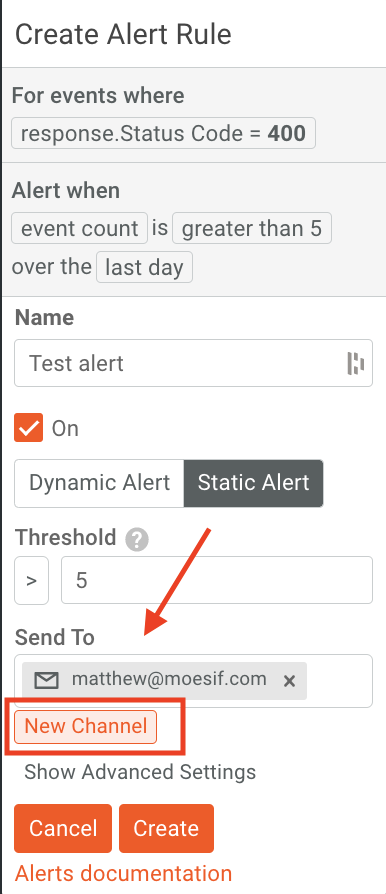
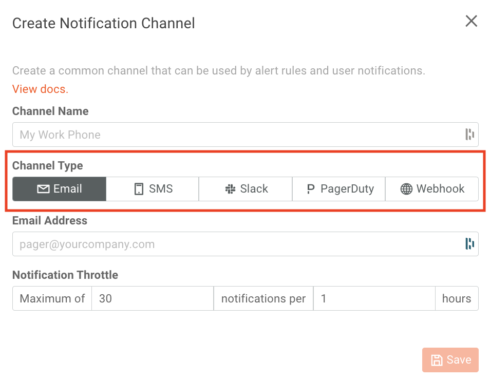
If Moesif detects a potential problem, it will notify you by email for example, or on any application that you have configured. If you would like to configure a new destination for alerts to go to, you will do this by adding another channel. To add a new channel, click on New Channel on the alert pane.
Then fill out the fields and select which channel you would like to send the alerts to. Lastly, click Save to save the details and create the channel.
The newly created channel can then be added as a channel for your new nd existing alerts.
Try It Out!
To try out Time Series functionality for yourself, Log in or sign up today to get started with Moesif!


Related Articles

API Strategy
Leveraging AI For a Better API Strategy
Learn how to leverage AI to build and fortify your API strategy. Improve design, governance, documentation, and align APIs with business outcomes.
API Strategy
The 5 Best Mixpanel Alternatives of 2025
Learn about the best Mixpanel alternatives to determine the right analytics solution for your use case.

API Development
How to Leverage Moesif Effectively for API Observability
Effectively leverage Moesif for API observability through best practices for integration, event enrichment, custom actions, and engineering workflow integrat...
API Strategy
How to Build an Internal Chargeback Model for Your API and AI Usage Using Moesif
Use Moesif to implement internal chargebacks and enable precise API and AI cost attribution for better transparency and resource optimization.