The Stripe Developer Experience and Docs Teardown

In this article, we are going to explore why the Stripe developer experience is so passionately supported by thousands of developers globally. One of Stripe’s missions is to increase the GDP of the internet, and over the last decade, they’ve successfully executed 250 million API requests per day and over 91 billion requests per year through their APIs. Stripe’s success has come from its focus on customer obsession, putting developers first and foremost, and innovative design practices. In this article, we are going to dive deep into some of Stripe’s design choices when it comes to developers and walk you through how you can take their learnings to build an ideal developer experience for your customers.
Three-Column Developer Documentation
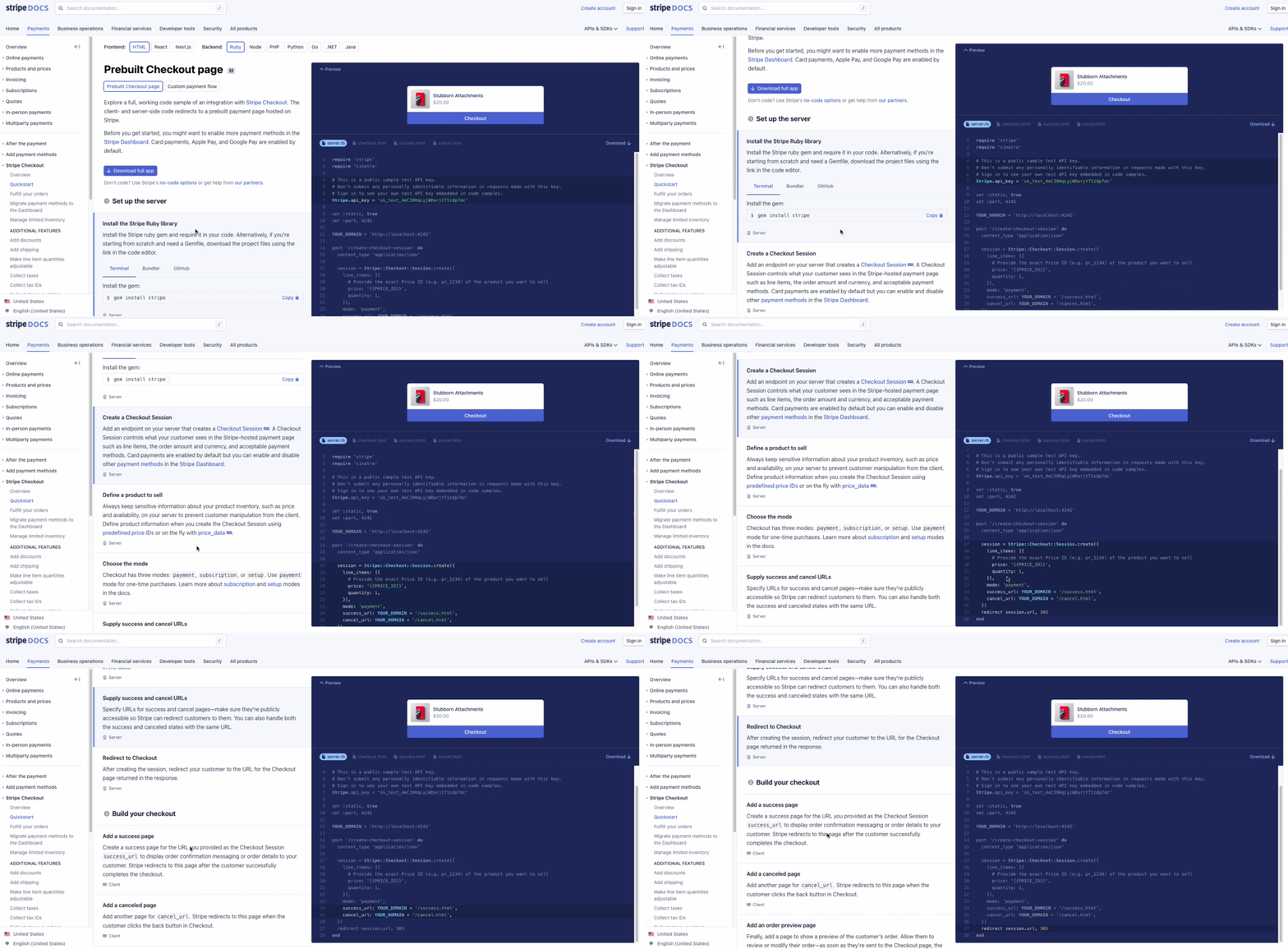
Stripe’s developer documentation is made famous by its three-column layout for organizing navigation, content discovery, and live code snippet execution. The top navigation breaks down the documentation into Stripe’s different product areas, such as Payments, Business operations, Developer tools, etc. On the left-hand side navigation, each action that you can take under each product has a corresponding Quickstart guide for developers to get started. Alongside the quickstart guide, Stripe provides in-depth documentation and tutorials built right into the navigation so developers don’t need to go to an external website or search the blog to get answers to their questions.
One of my favorite parts of the Stripe developer experience is their UI/UX. The Stripe UI/UX allows you to highlight over elements in the description window, which then highlights the areas of code in the code editor that pertains to that description. This is a really powerful feature for developers and provides a clean UI to help developers understand exactly what each code sample does. Additionally, when you hover your mouse over each section, a copy button appears for you to copy and paste that specific section of code. There’s also a download button to download the entire code sample provided by Stripe. Overall, the UI is clean, intuitive, and works as you’d expect it. A developer might not realize the documentation has all of these features since the entire experience from start to finish is so intuitive.

Slate - Responsive API Documentation
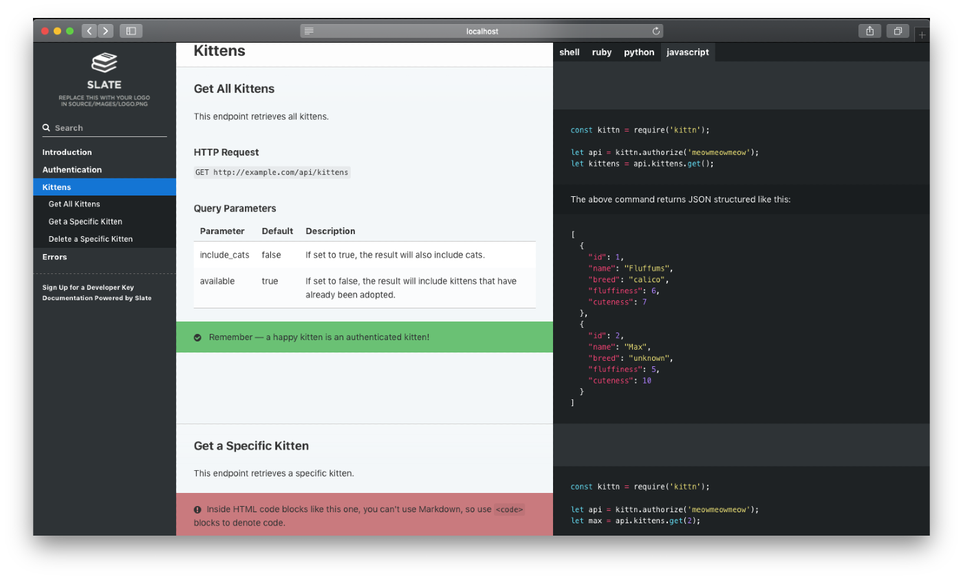
For startups or developers looking to build their own API documentation that has a similar look and feel to Stripe or PayPal, there’s an excellent open-source framework on GitHub called Slate. Slate comes out of the box with a clean and intuitive design and is fully responsive for all screen sizes. Additionally, since it’s fully open-source, you can make modifications to the source code and all of the docs are written in Markdown. Also from a developer experience perspective, including tutorials and video walkthroughs of a developer advocate consuming your API helps developers have a seamless experience consuming your API for the first time.
Moesif’s Developer Experience
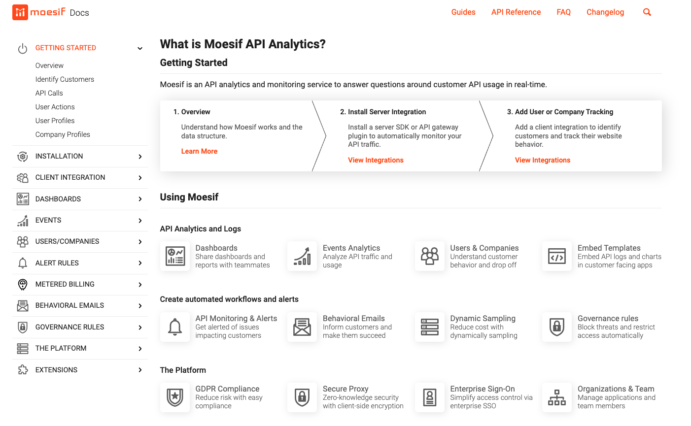
In terms of design, Moesif’s overall layout differs slightly from Slate and Stripe. In terms of developer experience, however, it still follows the same core principles. The left-hand side navigation has Getting Started materials and tutorials. One feature I really like about the documentation experience with Moesif is each main navigation item has items from the sub-navigation listed in a tile format on each homepage. This helps developers have a clean navigation experience through the menus and gives more context to what each option is going reveal in terms of content. Additionally, lots of Moesif’s API Documentation has embedded YouTube videos on specific topics which helps visual and auditory learners/developers. Adding YouTube videos to your developer documentation is a great way to capture traffic from Google searches, and this is something that Stripe could do a better job at. Learn more about integrating Moesif into your analytics stack here.

Moesif does a great job at listing each method to install their SDK on the side navigation, and also they have step-by-step instructions for each. Additionally, developers can identify what content is on the documentation page by looking at the right-side sub-navigation.
To interface with Moesif’s API, Moesif is using the open-source framework Slate to format their documentation. It’s been customized with Moesif’s color palette, looks beautiful, and is fully responsive on mobile.
The Developer Experience Roundup
If you are a developer looking to create documentation for your API, remember to include the following to provide developers with a superior developer experience:
- Responsive page layout for all screen sizes
- Code highlighting and syntax. When a developer highlights an element with their mouse, highlight the corresponding element on the code window.
- Provide visualizations, diagrams, and pictures in your API documentation
- Add YouTube videos to your documentation pages featuring a Developer Advocate that can walk developers through consuming your API
- Add copy and paste buttons to make it easy for developers to try the code instantly
- The three-column navigation structure is an ideal format for a developer audience
To learn more about Moesif, and why developers love their analytics solutions, visit the Moesif homepage to learn more.


