Time Series Reports
This document explains how to use Time Series metrics in the Moesif’s API Analytics suite.
Overview
A time-series visualizes how data changes over time. In the context of API and product analytics, a time-series analysis allows you to view aggregated trends for the API traffic over a certain time period. It provides a way of visualizing a data set that measures some quantity over regular time intervals.
In time-series graphs, time always takes the horizontal axis.
Use Cases and Benefits
Applications and use cases of time-series charts are endless. For example, disciplines such as statistics, signal processing, econometrics, and mathematical modeling extensively use time-series analysis.
Time-series reports provide many benefits in understanding API usage. Time-series data is easy to collect and track over time. Moesif’s Time Series metrics offer a great way to visually identify trends and easily compare historical data. Time-series analysis can also help companies to identify possible trends in the future as well by allowing them to visually predict where trends may be going.
In the context of APIs and product analytics, time-series charts work as an accessible medium to communicate data visualization to less technical audiences. Unlike other types of reports that may take some technical knowledge to decipher, the visual nature of a time-series report makes it easily digestible. This allows companies and teams to collaborate more widely and effectively in important business decision making processes.
You can create a time-series chart in Moesif for different time periods such as hourly, daily, weekly, monthly, or yearly. This allows you to compare usage over different time periods. For example, if the analysis shows an upward trend, it means your product is getting more users and traffic. This can help your developers to proactively start planning and optimizing the API for future traffic.
This information can also help improve API design, optimize performance, and troubleshoot issues. Additionally, you can use time-series to track customer satisfaction or monitor SLAs (service-level agreements).
Create Time Series Chart
To create a time-series chart, select + Create New in the navigation menu and then select Time Series from the API Observability section.

This creates a new Time Series workspace for you.
Filters
You can refine a time-series chart using filters. To access the filters, select the Select field list in the Filters pane.

For more information about the available filters, see Reference: Analytics Filters.
You can chain multiple filters together by selecting Where and OR.
Filter By Cohorts
You can further refine your time series by selecting a user or company cohort from the Performed By list:

This allows you to perform time series analysis on specific customer cohorts—for example, new users that have been encountering errors or events for enterprise customers. For example, selecting the cohort NonEnterprise customers will only consider non-enterprise customers in the time series analysis.

Inline Cohorts
Use inline cohorts to define a cohort criteria directly in your Time Series workspace. This allows you to instantly refine your analysis when you don’t already have an existing cohort to filter by.
To define an inline cohort, select Performed By and then select + Inline User Cohort or + Inline Company Cohort. It opens up a new dialog where you can define a cohort criteria using customer and event filters.
Named Variables for Filters
You can define named variables that hold filter values and then use it across filters.
To add filter variables, select Variables. Then select Add Variables to define a variable. After defining your variables, select Save.

To use a variable, enter the variable name enclosed in double curly braces in a filter value. For example:

You must manually enter the variable name this way to use it. You can quickly check defined variables by hovering over Variables—the tooltip shows the defined variables and their values.
This feature allows you to avoid manually updating filter values in complex and dynamic filtering scenarios.
Include Data of New Users and Companies Only
To take only new users and companies into consideration for a time-series chart, enable the New Users Only and New Companies Only filters respectively. These two filters allow you to perform the time-series analysis only for users or companies who’ve made their first API call within the time you specify.
You can choose between the following options regarding how Moesif considers the first seen time for new users and companies:
| First seen time | How it works | Example use cases |
|---|---|---|
| In Entire Range | Moesif looks at the entire time period you've selected for your Time Series analysis and identifies the absolute first time each user or company was ever seen within that full analysis period. |
|
| In Each Interval | Moesif considers the first seen time within each individual interval of your Time Series analysis. For example, if your graph has a daily interval, Moesif determines if a user or company was first seen on each specific day. |
|
For example, let’s consider you’re using a time series analysis for a week, from Jan 1 to Jan 7, with a daily interval. Moesif identifies a customer first seen on Jan 5. Here’s how Moesif performs the analysis and plots the graph depending on the first seen time option.
- In Each Interval
- Moesif considers the customer new only on Jan 5. Moesif doesn’t consider them new before or after that date.
- In Entire Range
- Moesif considers the customer new throughout the entire range of the analysis period.
Group Data
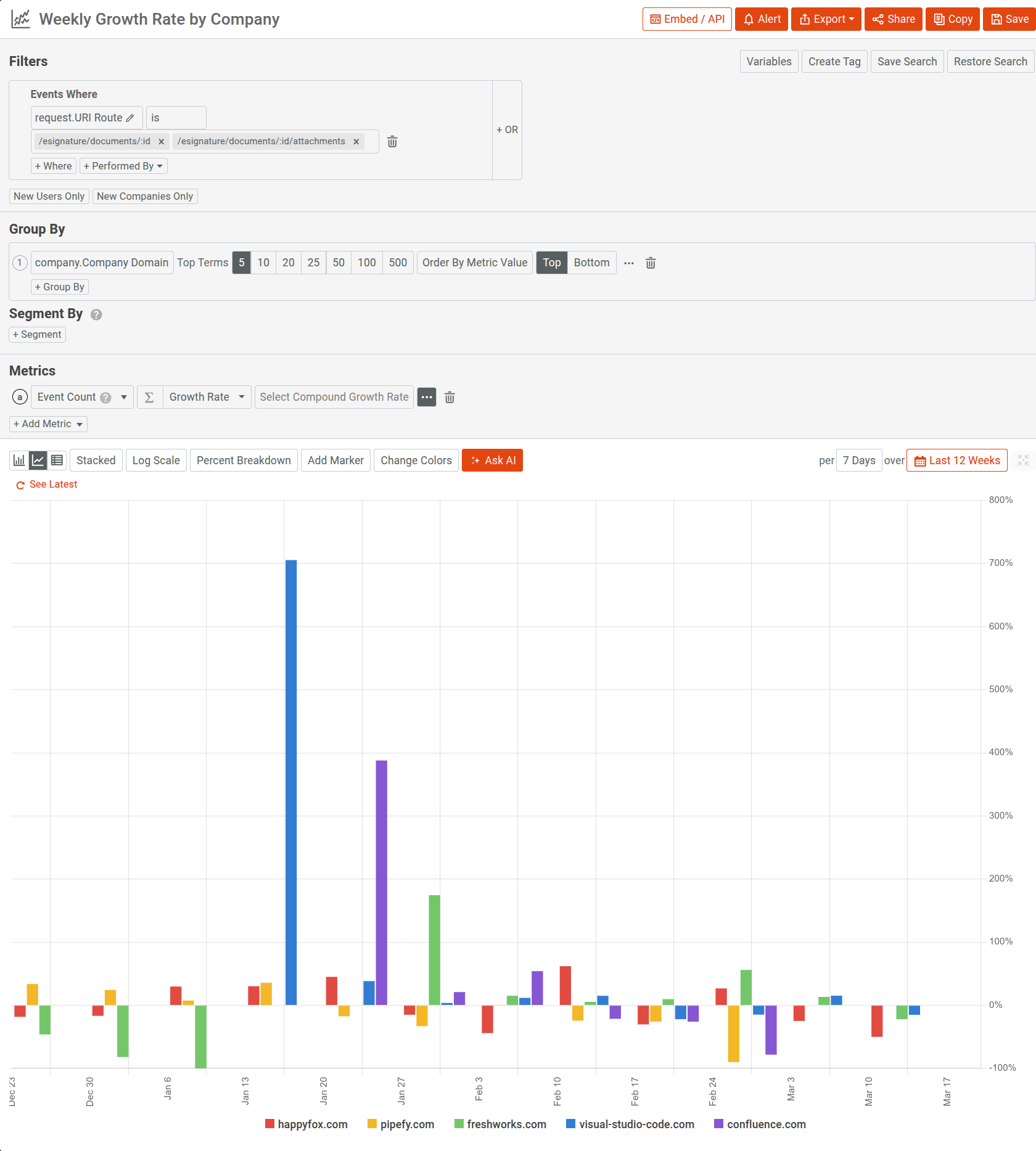
Moesif Time Series charts support grouping data by categories. Use the Group By option to group data by a specific criteria. You can group by HTTP response status code, company domain, or user ID. For example, the following time-series chart groups by Response.StatusCode for HTTP POST requests. This can help identify trends in specific responses and solve potential problems if the trends become negative—for example, a high occurrence of error status codes.

You can choose the number of data points the chart uses to plot the graph by selecting a number for Top Terms.
Segment Data
If you want to use your own criteria to segment data by custom groups, use the Segment By option.

For example, to segment by country, select + Segment and then select Request.GeoIP.Country from the Select Field list.
After selecting + Segment, Moesif generates a unique name for the segment that you can change—for example, segmentcd635fbb. You can reference this name when you define a custom metric formula.
Calculation Method of Time Intervals
Moesif aligns the intervals to the top and bottom of the interval. So if you select a daily interval, then each metric equals the time from 12:00 AM to 11:59 PM per day in your specified timezone.
Since Moesif always aligns to the calendar interval, the very last one may not be fully complete. For example, if the current time is 5:55 PM and you select a daily interval, then the last interval only contains partial data from 12:00 AM to 5:55 PM.
By default, Moesif uses the browser time as the time zone. To change your global time zone, configure the timezone in your Apps and Teams settings.
Configure Metrics and Chart
Moesif Time Series offers different ways to specify, configure, and visualize metrics.
Select the Metrics to Plot
By default, Time Series plots only the Event Count metric. You can always plot more than one metric in the same chart by selecting + Add Metric.
The following predefined metrics are available:
- Event count
- Event accumulation
- Unique users
- Unique companies
- Unique sessions or API keys
- Average latency
- Maximum latency
- P90 latency
- Request body count
- Response body count
- Maximum available balance for subscriptions
- Maximum pending activity for subscriptions
You can also add custom metrics by selecting a new event field or specifying a custom formula that references other metrics.
Create Custom Metric
You can create custom metrics in two ways:
- Add another event field and specify how to compute the metric from the field.
- Add a custom formula that computes a metric from other metrics.
Add Another Event Field
- Select + Add Metric and then select { } Select Field.
![Add custom event field in a Time Series chart]()
- Select an event field from the Select a field list—for example, Duration (Milliseconds). Alternatively, write a script that computes the event field.
-
Select a computation method for the values of the event field. For example, if you’ve selected Duration (Milliseconds), you can select
avgto display the average elapsed duration of API calls over time.The computation methods available depend on the data type of the event field. For example, numeric types have the following computation methods available:
sumavgminmaxaccumulatepercentiledistinctsum of countavg of count,min of count,max of count(in case of arrays in request or response body, count is number of elements in the array).sum of key count, etc. (in case of object in request or response body, key count is number of keys in the object).
- Optionally, configure the rolling and transformation function for your custom metric.

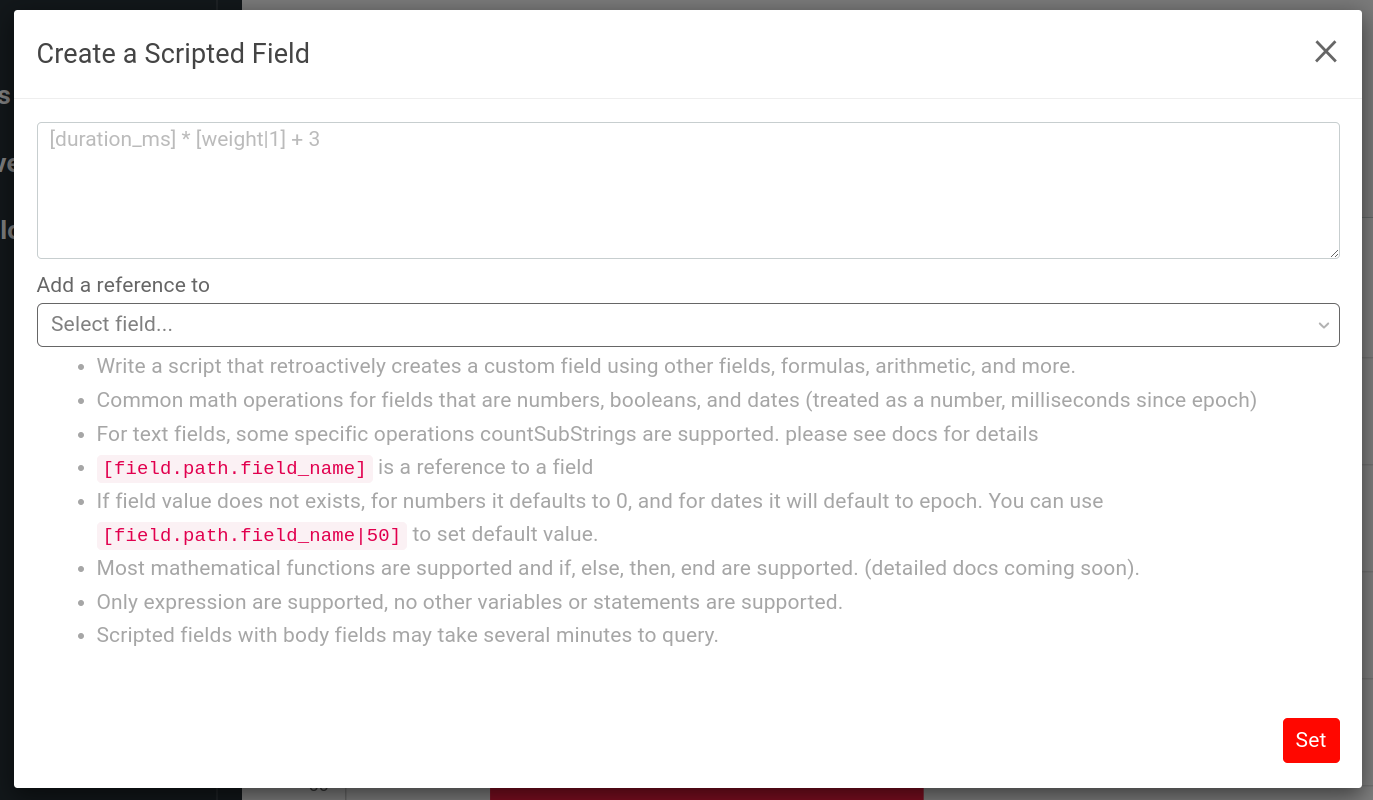
Add a Scripted Field
If a field does not exist in your request or response, you can compute the field using a script. The script retroactively creates a custom field from other fields, using formulas, arithmetic, and conditional expressions. A scripted field has the following capabilities and limitations:
- Only numbers, booleans, and datetime data types (treated as a number, milliseconds since epoch) are supported.
[field.path.field_name]references a field.- If field value does not exist, for numbers it defaults to 0, and for dates it defaults to the epoch. You can use
[field.path.field_name|50]to set the default value. - Most mathematical functions are supported. Conditional expressions using
if,else,then, andendoperators are supported. - Only expressions are supported. No other variables or statements are supported. Scripted fields with body fields may take several minutes to query.
To add a scripted field, follow these steps:
- Select + Add Metric and then select { } Select Field.
![Add custom event field in a Time Series chart]()
- Select <> Scripted Field.
![Add a scripted field in a Time Series chart]()
- Write the script and then select Set. The field list following the script text box contains all the existing fields so that you can easily reference them in your script.
![Scripted field dialog]()

Add a Custom Formula
Moesif allows you to create a custom arithmetic formula to use the values from other metrics or segments that you’ve defined. Moesif assigns a unique letter to each metric you plot. You can then reference those letters to build an arithmetic expression that computes a custom metric. You can also refer to segments in the custom formula as well by using the segment name.
The following example defines the custom metric formula a/b where a corresponds to an Event Count metric and b corresponds to a Unique Users metric.

To use segments as part of your formula, use the syntax SEGMENT_NAME.METRIC_LETTER.
For example, if you have two segments API and All, and a metric a, you can define the formula (API.a/All.a)*100.
To add a custom formula and plot its metric, follow these steps:
- Select + Add Metric and then select Enter Formula.
![Creating a custom formula in a Time Series chart]()
- Enter your formula. The following operators are supported for a formula:
- Addition
(+) - Subtraction (
-) - Division (
/) - Multiplication (
*) - Exponentiation (
^) - Square root (
sqrt) - Natural logarithm (
ln,log) - Base-10 or common logarithm (
log10) - Base-2 or binary logarithm (
log2)
- Addition

Apply Rolling and Transformation Functions
Moesif Time Series supports several rolling and transformation functions that you can apply to your plots.
The following sections discuss the different types of functions available:
Growth Rate
Computes the growth rate as a percentage across time.
The most basic growth rate calculation follows the formula (Current Period - Previous Period) / Previous Period. Moesif also supports compounded monthly growth rates (CMGR). Use compound growth rates to get smoother and longer-term growth rates. Compound growth rates for 3 months or 6 months are common metrics for SaaS products.
Rolling Window
Allows you to specify a rolling window size for the metrics plot. For example, a 7-day rolling window of unique users, showing you the number of unique users each week over a specific time period.
Rolling Sum
Calculates the sum of the values for each overlapping window.
Rolling Max
Returns the rolling maximum value of the metric for each overlapping window.
Rolling Min
Returns the rolling minimum value of the metric for each overlapping window.
Diff
Calculates the difference between two consecutive periods.
Rolling Unweighted Average
Returns the rolling average for each overlapping window. For example, to see how your customers’ API usage is trending against their trend line, you can plot customers’ daily event count and their 7-day rolling average. Then use a formula to subtract the two to see how their usage is trending.
Rolling Weighted Average
Contains the following weighted average rolling functions:
- Linear
- Returns the weighted average for each overlapping window where older data points contribute a linearly less amount to the total average. For example, you can use this function to reduce lag that typically occurs from a rolling average. This allows you to observe rapid changes that occur to a metric in real time as older data points contribute less to the mean.
- Exponential
- Returns the single exponential rolling average for each overlapping window where older data points become exponentially less important.
- Double exponential
- Returns the double exponential rolling average for each overlapping window where older data points become exponentially less important. For example, this function allows you to better track an underlying linear trend in a metric that you may not appear in a single exponential rolling average. This is partially true for usage metrics like Event Count that may go up linearly over time.
Maximum Throughput
Calculates maximum value per smaller time unit within each interval.
Minimum Throughput
Calculates minimum value per smaller time unit within each interval.
Average Throughput
Calculates average value of smaller time unit within each interval.
Lag Plot
Returns the metric value from a specific number of time intervals ago. You can use a lag plot to check for randomness in data in a time series. You can also use lag plots in formulas to create comparisons between current and past data—for example, percentage of change compared to yesterday.
Rolling Standard Deviation
Returns the standard deviation of a rolling average for each overlapping window. The averaging function can be either the unweighted average or the linear related average.
Shift Rolling Window
After you select a rolling window function, you have the option to shift your window by an amount:
- To shift your window positively by one mark, select Shift + 1.
- To shift your window positively by two marks, select Shift + 2.
- To specify a custom shift, specify a positive or negative number in the Custom Shift field and select Apply. A positive number shifts the window forward and a negative number shifts the window backward.

Change Chart Style
You can change how Moesif plots the time-series charts and toggle from one style to another. This allows you to view the metrics in multiple ways.
The following styles are available in Time Series:

If you want to combine bar and line charts, use combo charts.
Line Chart
A line chart plots your metrics by connecting the data points with lines. Each data point represents a value of the metric at a specific time period. Line charts help you visualize and understand how metrics change over time.
Bar Chart
A bar chart represents data with rectangular bars. The height of each bar corresponds to a quantity of the data and each bar belongs to a category. In Moesif Time Series, the category is time and each bar represents a fixed time interval. For example, if you plot the Event Count metric in a line chart for the past 12 weeks with an interval of 7 days, each bar represents data for a 7-day interval. The height of each bar changes in proportion to the number of events during a 7-day period.
Table
The table view shows the metrics data in a tabular format, similar to a spreadsheet. Save and share Moesif gives you several options to share a Time Series workspace. Before you can share, you must first save the workspace to a dashboard.
After saving, follow the instructions in Sharing Workspaces to share your workspace.
Metric Configuration and Shortcuts Menu
For each metric in the Metrics pane, select … Configuration and Shortcuts to further customize your chart.

Custom Name
Select the Custom Name checkbox to set a custom name for the metric.
Sampling Weights
Select the Weighted checkbox to enable sampling weights for the metric.
This option is enabled by default and Moesif extrapolates the metric using any sampling rules you have defined in Dyanamic Sampling. If you don’t have any dynamic sampling enabled, weighted and unweighted have no difference.
Combo Charts
A combo chart combines line and bar charts. Combo charts allow you to represent multiple time series metric in the same chart for better visualization and comparison.
To create a combo chart, open the … Configuration and Shortcuts menu and then select Combo Chart.
Customize Vertical Axis
When you have more than one metric in a chart, you may want to use independent Y-axes for each. Metrics on separate Y-axes can vertically scale independently of one another within the same chart. This proves useful in scenarios such as comparing values at very different scales.
To use a different Y-axis for your metric, open the … Configuration and Shortcuts menu and then select Assign to Y-Axis. The following Y-axis types are available:
- Y-Axis A
- The default Y-axis.
It’s always on the left side of the chart. If you select a different Y-axis for a metric, the Y-axis appears on the right side. When you select the Log Scale option, it only affects this default Y-axis.
- Y-Axis B
- Expresses a metric with a decimal ratio as a whole number percentage—for example,
0.5as50%. This axis multiplies the values by 100 and adds a percentage sign to the chart units. - Y-Axis C
- Adds a new Y-axis on the right side of the chart based on the metric values.
- Y-Axis D
- Adds a new Y-axis on the right side of the chart based on the metric values.
Duplicate a Metric
Select Duplicate to duplicate the corresponding metric in the same chart.
Add Comparison
This option offsets the corresponding metric by a time interval and adds the metric in the same chart.
After selecting Add Comparison, select one of the default time intervals. Then you can further customize the metric name, time interval, and the comparison formula.
Under the hood, comparison metrics use lag plot. Moesif supports only one rolling or transformation function for each workspace. Therefore, to create a new comparison, remove any existing functions from the workspace.
Folding
You can fold your time series chart to understand cyclic trends like hour per day or day of week.

Folding is enabled for these specific chart intervals only:
1 Minute1 Hour1 Day1 Week
Save and Share
Moesif gives you several options to share a Time Series workspace. Before you can share, you must first save the workspace to a dashboard.
After saving, follow the instructions in Sharing Workspaces to share your workspace.
AI Explain : Use AI to Get Insights About Time Series Metrics
AI Explain gives you an AI-powered conversational interface where you can ask questions and gain insights about event analytics data.
In a Time Series workspace, select Ask AI to open up the interface.

To get started, you can choose from the sample prompts. Otherwise, type in your query and press Enter.
Download Chart Data
You can download your Time Series chart data in CSV format for further processing in tools like Microsoft Excel:
- Select Export.
- Select Download Chart - Current View or Download Chart - All Terms.